New Tab Page
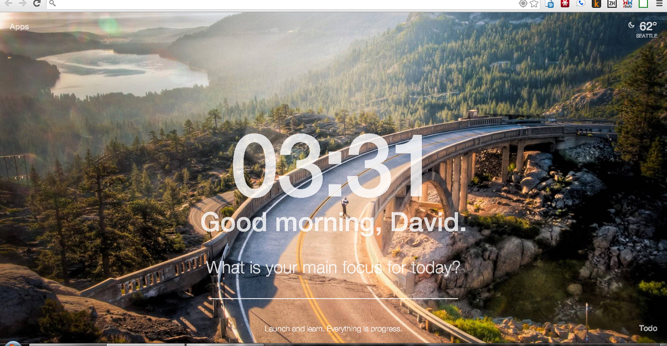
21 Aug 2014This is what my browser new tab page looks like:

There are a few reasons I like this:
- the beautiful background image changes every day. It’s naturally inspiring, & I love the variety
- this puts the time front and center, keeping me on track at a time I am all too vulnerable to lose it (opening a fresh web browser tab)
- it has an interesting inspiring quote at the bottom. almost all of them are new to me. and I like the general attitude.
I like the “What is your main focus for today?” prompt. I’m a big fan of focus. But I don’t like that it actually expects me to write something in there. That feels like too much of an “assignment”, which is not what I am looking for from my new tab page. Sometimes this causes me to subconsciously ignore the prompt.
I do like the temperature & weather widget in the top right. But I don’t look at it very often.
I don’t care for the to-do list in the bottom right corner. Maybe it would be useful, but that’s not the place I’m looking for a to-do list. I prefer handwritten, GTBee (for that extra sting), and the occasional (digital) Sticky Note widget.
For a new tab page like this, try the free Momentum extension for Chrome.
